

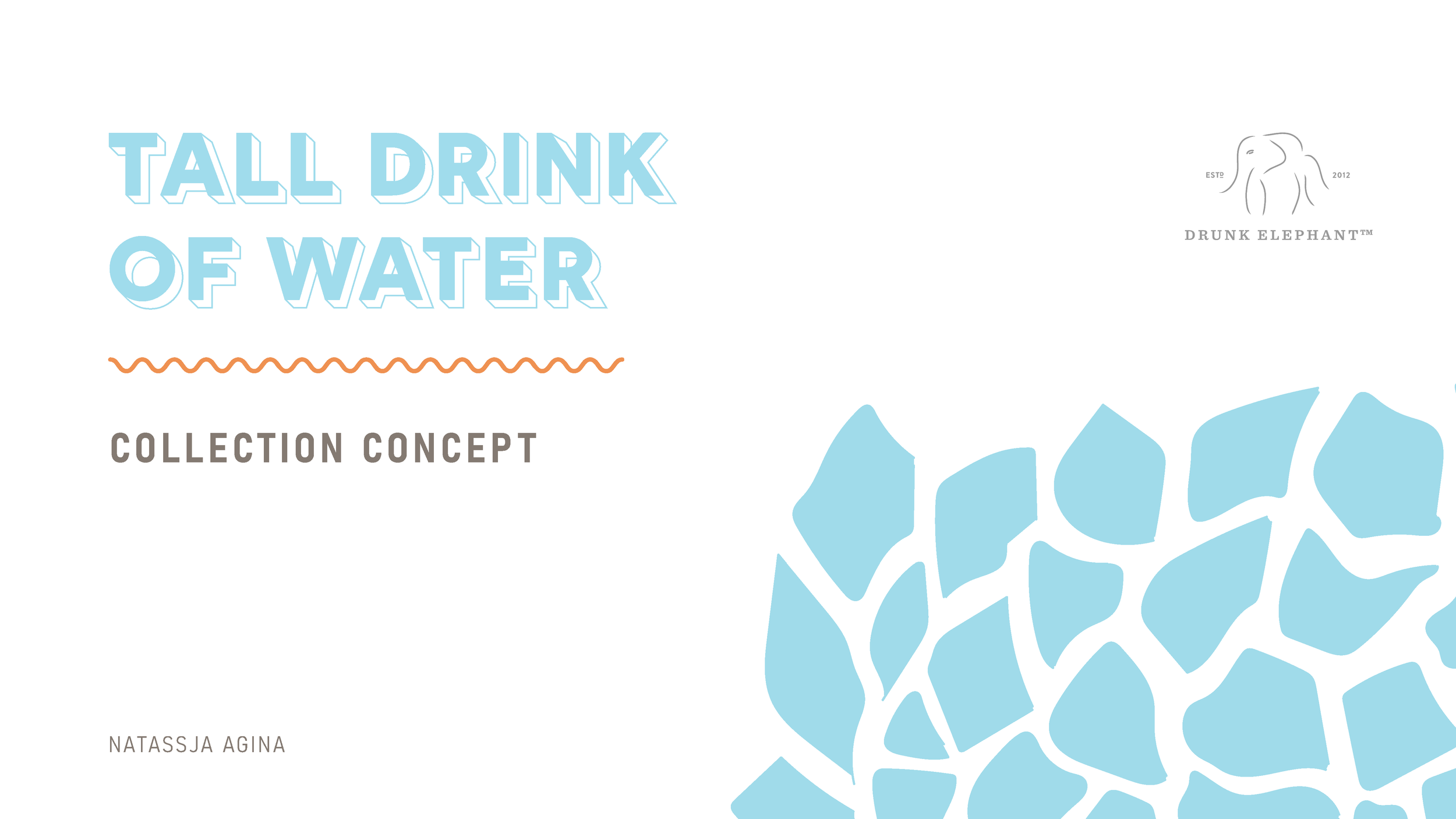
Concept, design, illustration, & pitch deck for a bespoke branded merch collection promoting skincare brand Drunk Elephant.
Created for design studio Harper + Scott.
Harper + Scott asked me to come up with a concept for a branded merchandise collection that would help promote a popular product from luxury skincare brand Drunk Elephant through influencer marketing.

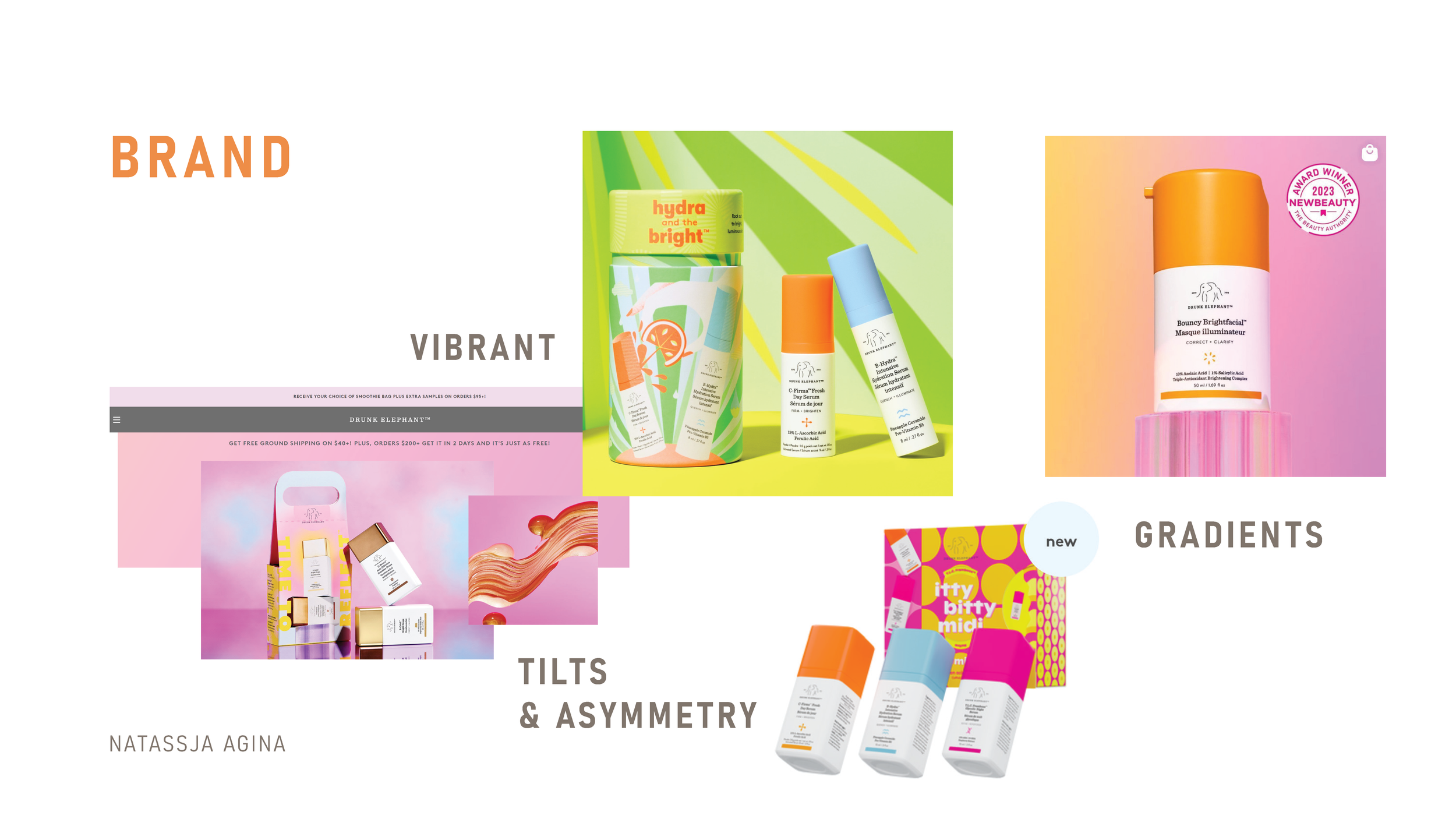
I did a deep dive into the Drunk Elephant skincare brand to get a comprehensive understanding of their personality and style, looking at their website, their packaging, their social media, and their holiday kits
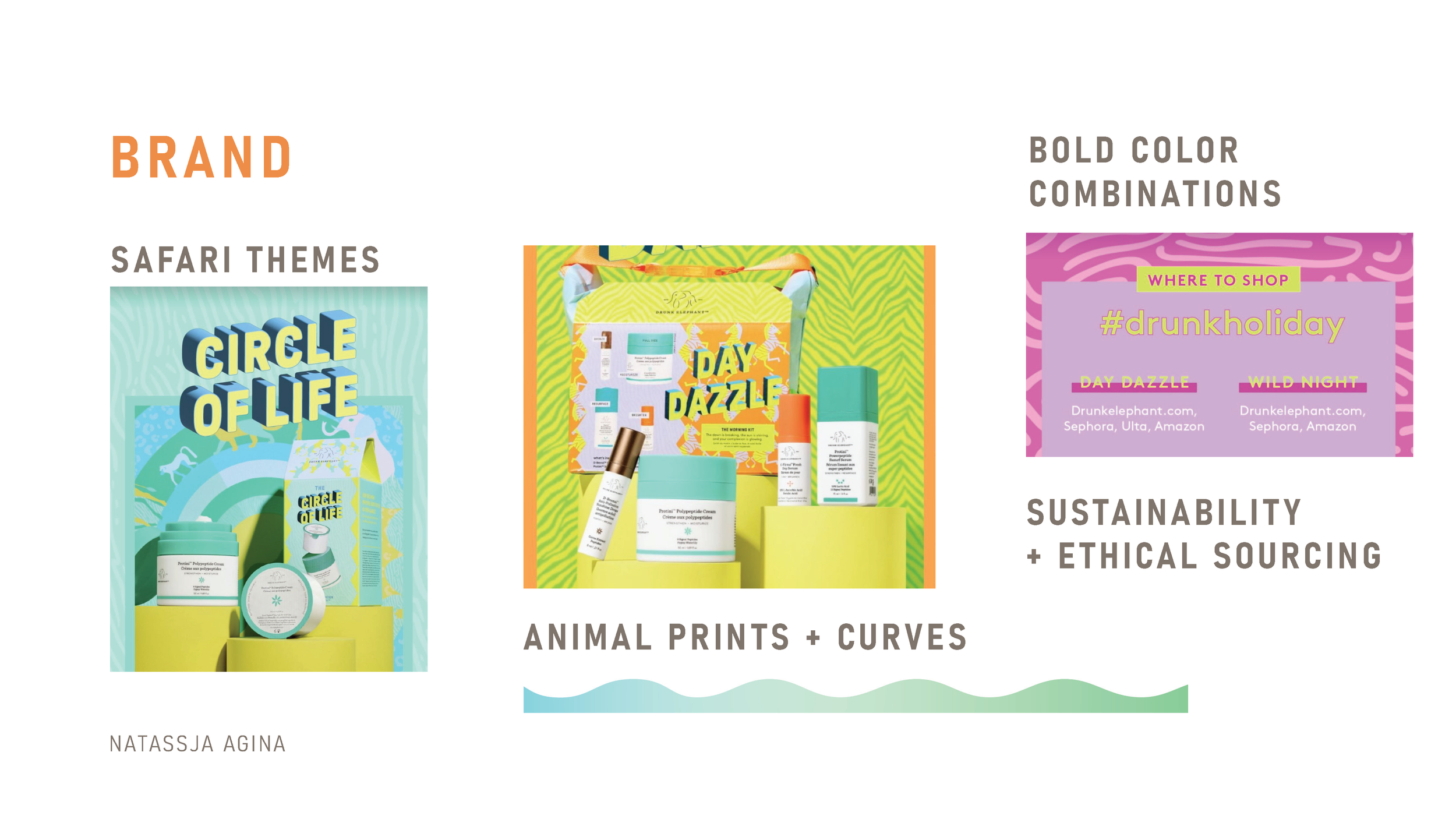
Through this look at the brand, I gathered that their style is typically bold, energetic, and quirky, with vibrant colors, gradients, and tilted product photos. In their holiday kits, I saw a consistent use of animal prints, bold color combinations, and safari themes. I also noticed a mention of sustainability and ethical sourcing on their blog.
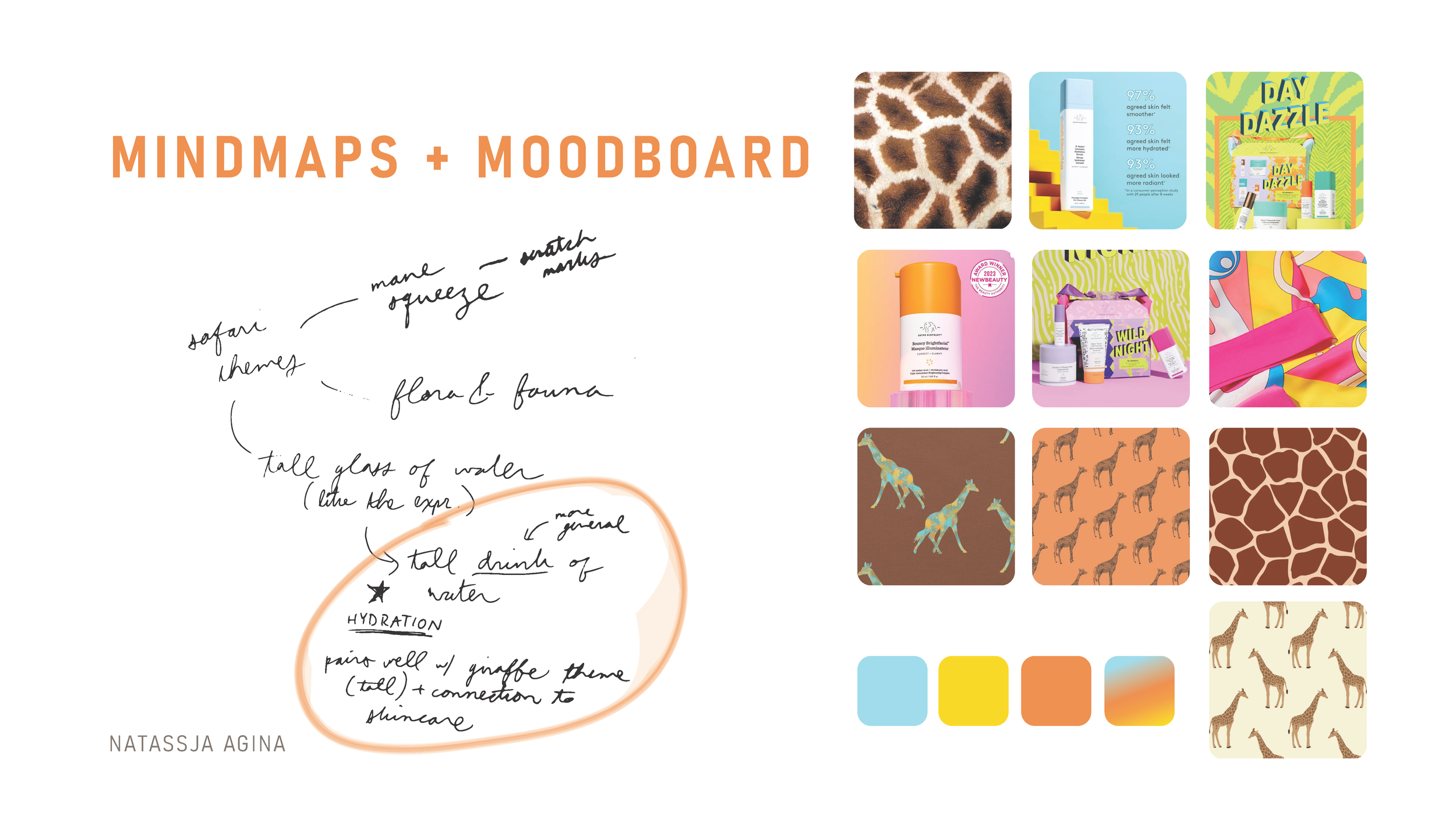
MINDMAP + MOODBOARD
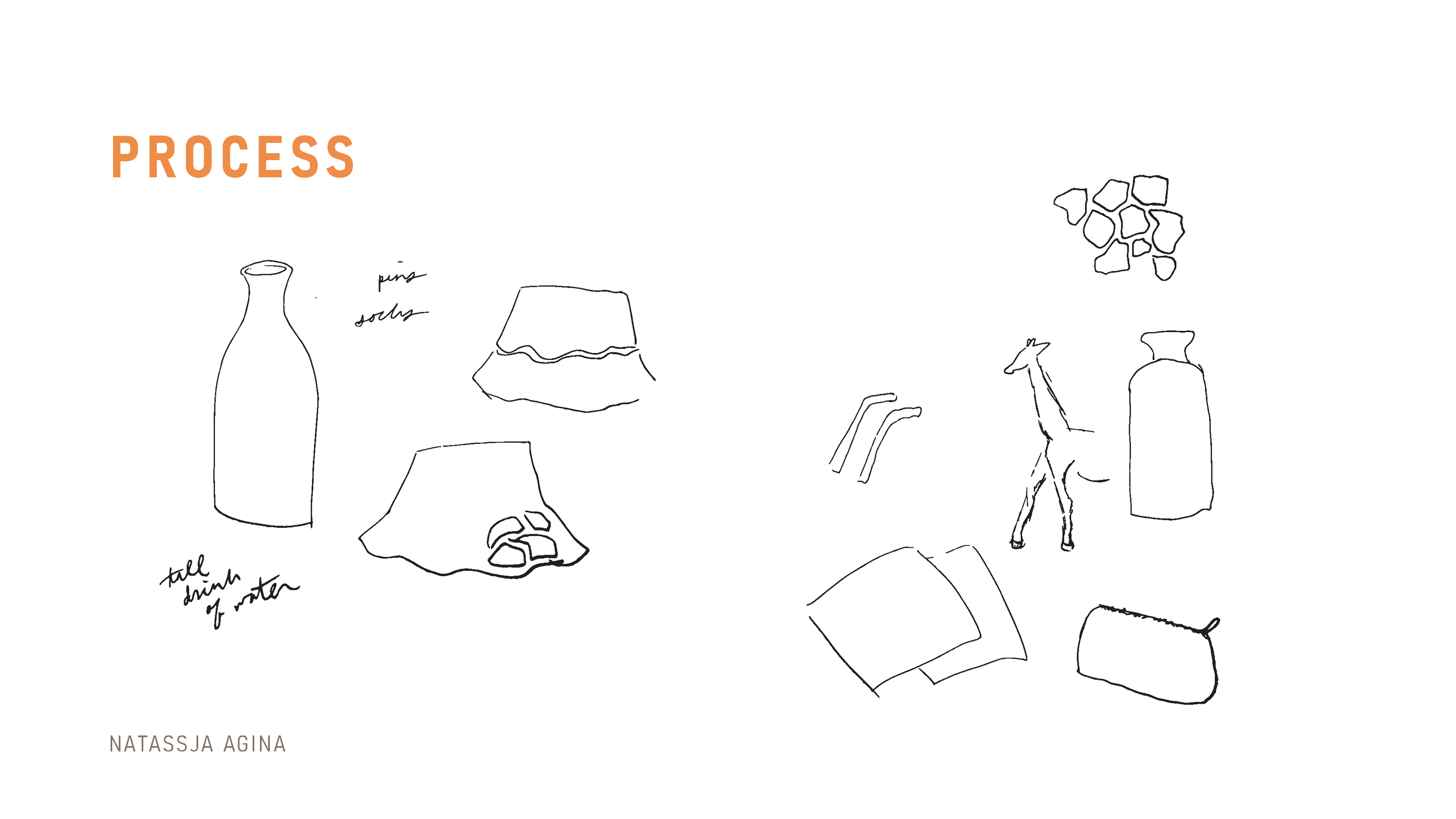
Inspired by the safari themed holiday kits, I did some mind-mapping to come up with a concept that would work cohesively with a set of retail goods and a safari animal theme, while promoting the brand and particularly a specific popular product.
Some other ideas were “mane squeeze” spelled like a lion’s mane, and “flora & fauna”
Through this process I came up with the “Tall Drink of Water” concept, which felt like the perfect way to celebrate the popular F-balm hydrating waterfacial while tying into a giraffe-inspired theme, which provided a framework for the visual motifs and patterns
The water blue color was inspired by the theme of hydration, and I wanted to use colors that would complement it while keeping the collection vibrant and bold.
PROCESS
Brainstorming / Selection of items
Bucket hat - safari feel and popular, trendy item in the influencer sphere and in general with the resurgence of Y2K fashion; also an item that helps protect skin from sun damage
Water bottle - to go with theme of hydration
Considered straws or at-home carafe but felt water bottle would be more useful and make more of a statement in terms of providing brand exposure and customer connection since you carry it around in public
Microfiber towels - a useful part of the skincare routine which can foster connection and loyalty to the brand among customers
Zip-up Pouch
Perfect for traveling with the brand’s skincare products
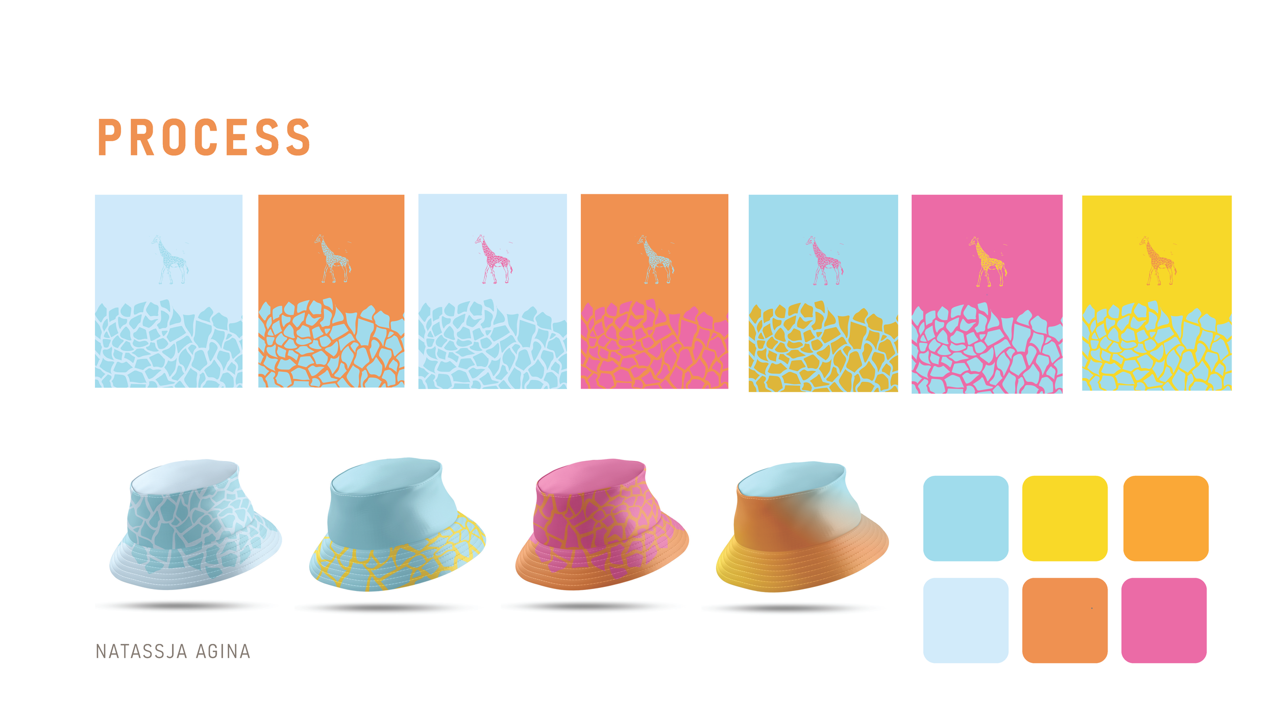
PROCESS PART 2 (COLOR SELECTION)
I originally started out with a broader color palette that I experimented with in different combinations, some combinations didn’t provide enough contrast or made some of the colors feel washed out; ultimately I wanted the water blue to be one of the focal colors and I narrowed the palette down to that color, the energetic yellow, and the darker orange, which provided more contrast while complimenting the blue
I also felt they matched better with the F-balm’s promise to “revive” your skin
PROCESS PART 3
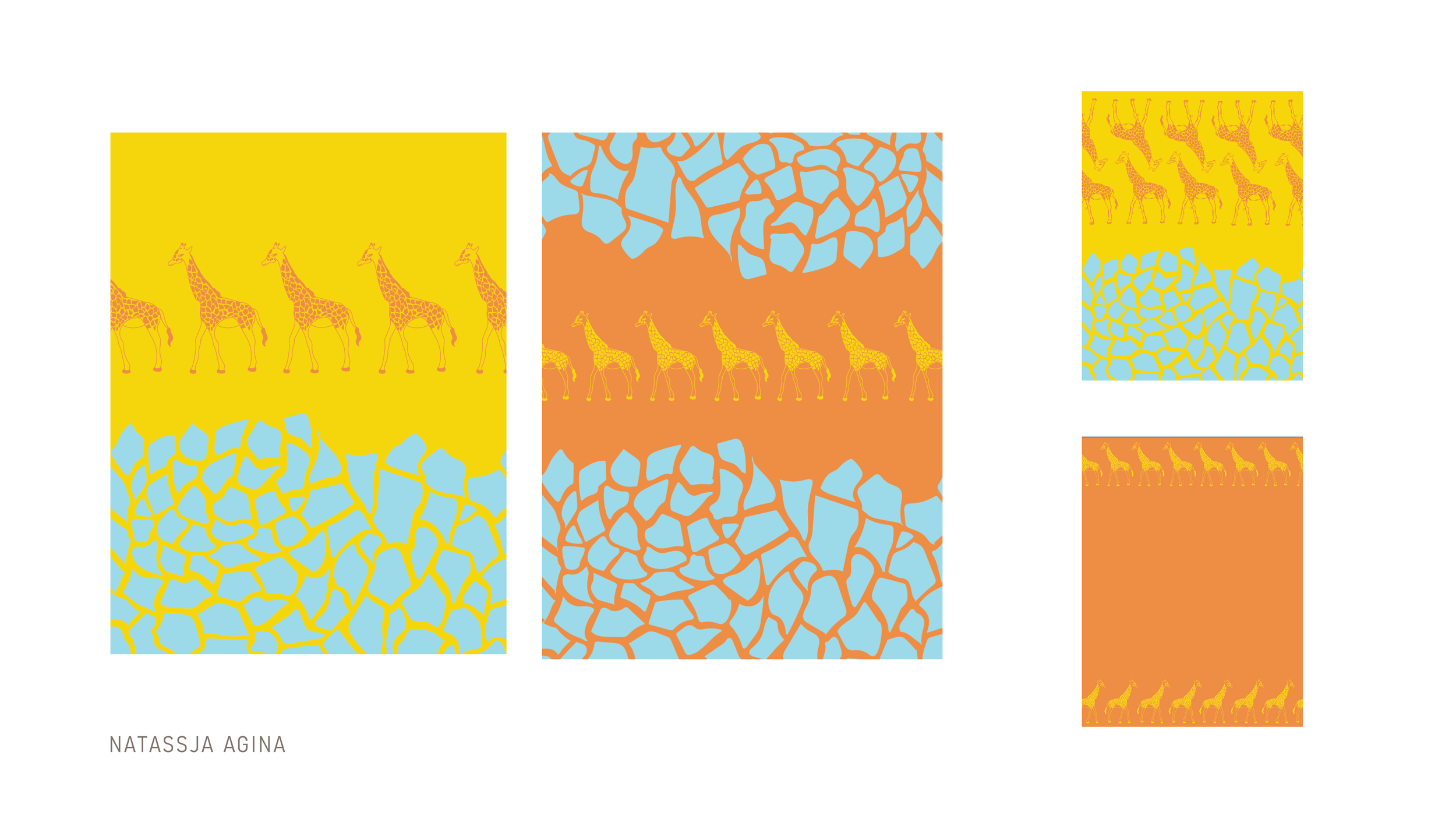
I refined the graphics down further, trying out different compositions with my giraffe illustration and print
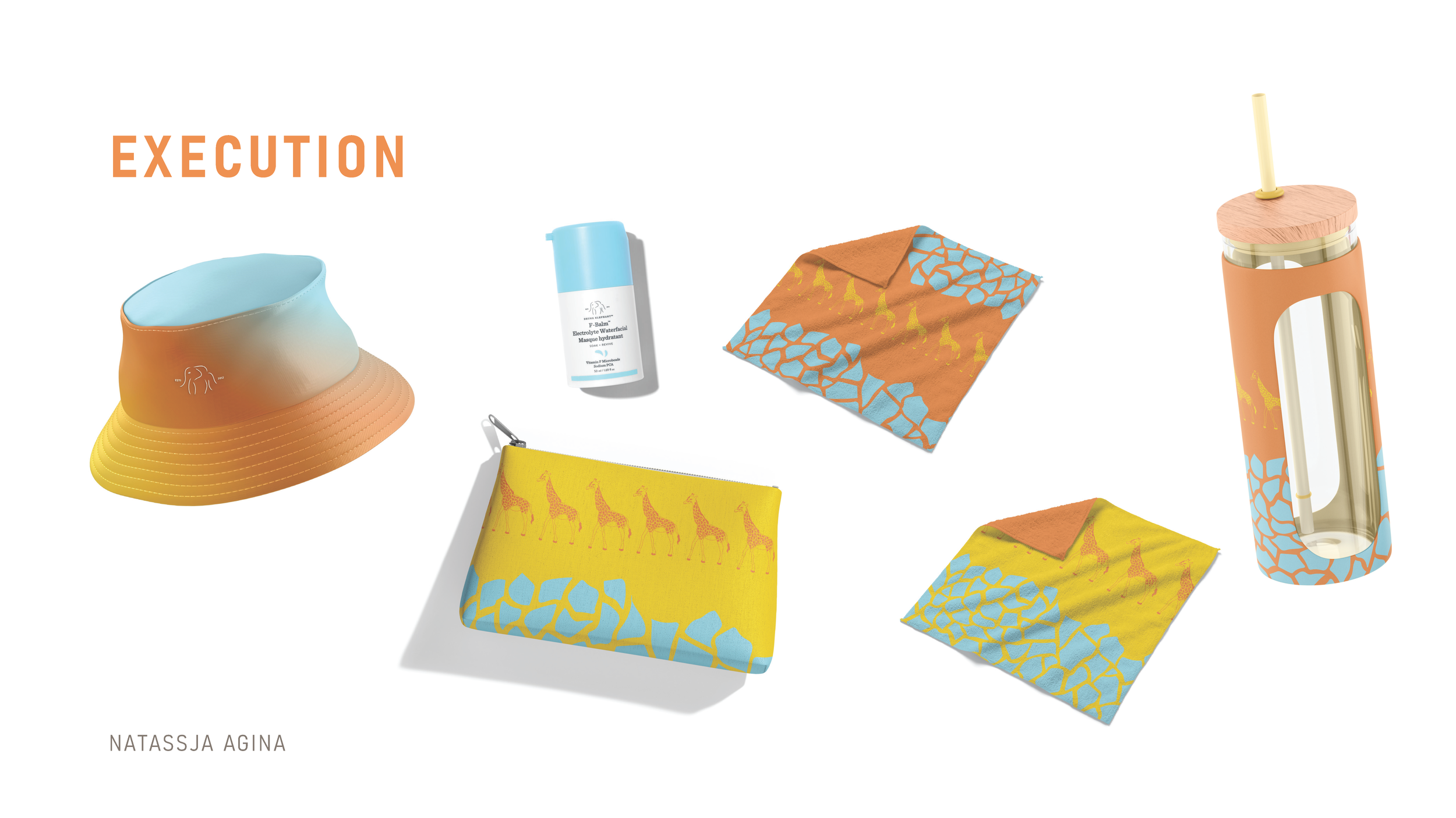
And here was the final application. All of the items either have a connection to the hydrating element, a skincare purpose, or an influencer angle. I chose the Y2K bucket hat for its safari feel and trendiness which would work well in influencer marketing, the travel pouch as a logical item to carry skincare products in, the microfiber face towels as a useful part of a skincare routine which can foster a sense of connection and loyalty to the brand among customers, and the water bottle for hydration. I also specifically chose a water bottle design with a bamboo lid which I felt would match the brand style and ethos, with its connection to sustainability and ethical sourcing.