
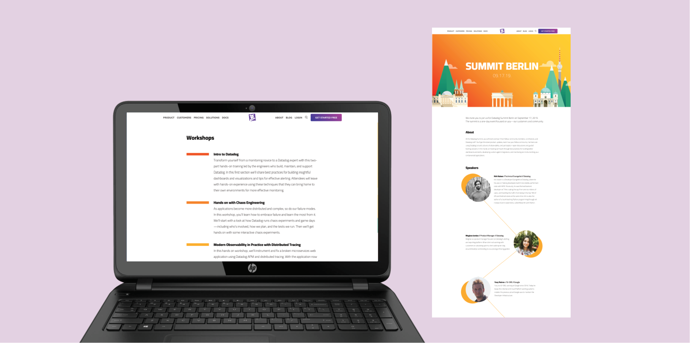
Figma webpage for Datadog’s Berlin Summit.
As part of a design assignment during my time interviewing for a Graphic Design role at Datadog, I was asked to design a webpage for the Berlin Summit. I had to design several sections, including the introduction, speakers, workshops offered, location of the summit, an RSVP bar, and additional resources.
I decided to incorporate elements of the hero banner illustration (such as the color palette and use of geometric shapes and diagonal lines) into the design to create a sense of cohesiveness.

Because the page content included a lot of information, I wanted to break up some of the text in visually interesting ways and add some white space so that the reader would not be overwhelmed. To keep things interesting but also organized, in the Speakers section, for example, I aligned all bios and headshots to strict margins on either side and made the text box widths consistent, but tried to create some visual rhythm and break up the text by adding the circle and line motifs (meant to resemble connecting data points) and alternating sides for each bio.
I thought the yellow circles would add some visual interest and create a sense of consistency for the photos, which had varying backgrounds and even a black and white filter on one. I also used colors from the hero banner's gradient background to "color-code" and visually organize the workshops offered at the summit.
For my process, I tried out multiple different layouts and variations for several sections of the webpage. For example, one version of the Speakers section had all headshots left-aligned with their bios to the right, and one version of the Resources section had much larger link images that were left aligned and on top of one another, while another had those larger images centered. I've attached screenshots of some of the other layouts/configurations I tried below for reference.
