

Logo design and branding for a traditional Puerto Rican beverage.
I decided to imagine what a brand could look like if it sold artisanal coquito, a traditional alcoholic beverage from Puerto Rico that my mom made every Christmas (don’t worry, there was a non-alcoholic one for the kids).
The name of the brand is a play on words: it could be viewed both as an abbreviation of the beverage name, and as a reference to the coqui frog, a symbol of Puerto Rico and an animal native to its rainforest.

Logo Design
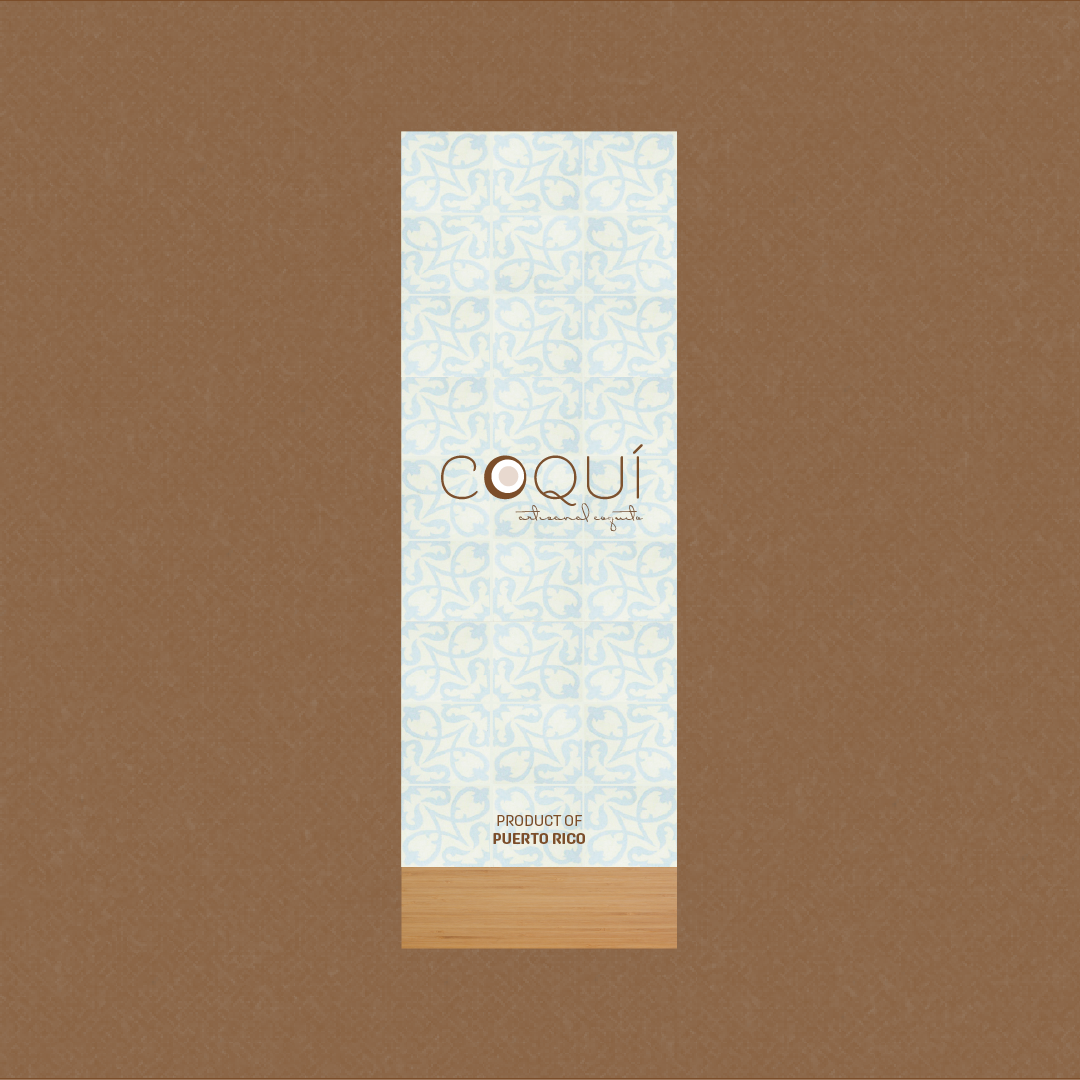
For the logo, I wanted to highlight the ingredient after which the drink, coquito (which means “little coconut” in Spanish) is named. I created an abstracted coconut to replace the “o” in the brand name.
I chose Beloved Sans as the main typeface because it was minimal and sophisticated, but unique and fun with quirky curved touches on the Q and the C. For the “subtitle,” I used Dr Carbfred Pro to add more flare and emphasize the handmade, authentic, and traditional nature of the drink.


Color Palette
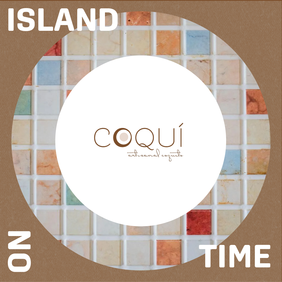
The inspiration for the brand color palette comes from the tropical landscape and pastel architecture of Puerto Rico.